Introduction
Tableau is a powerful data visualization tool that allows users to create insightful and interactive dashboards. One key aspect of effective visualization is conveying information clearly, which includes having dynamic axis titles that adapt based on selected parameters or filters. Here’s a step-by-step guide on how to achieve this:
Step 1: Connect Data Source and Create a Worksheet📑
Start by connecting Tableau to your desired data source. Once connected, navigate to a new worksheet by clicking on the “New Worksheet” tab. Here I am using the Superstore dataset.
Step 2: Create a Chart 📈
Choose the appropriate chart type based on your data analysis needs. For instance, let’s select a bar chart to demonstrate dynamic axis titles.
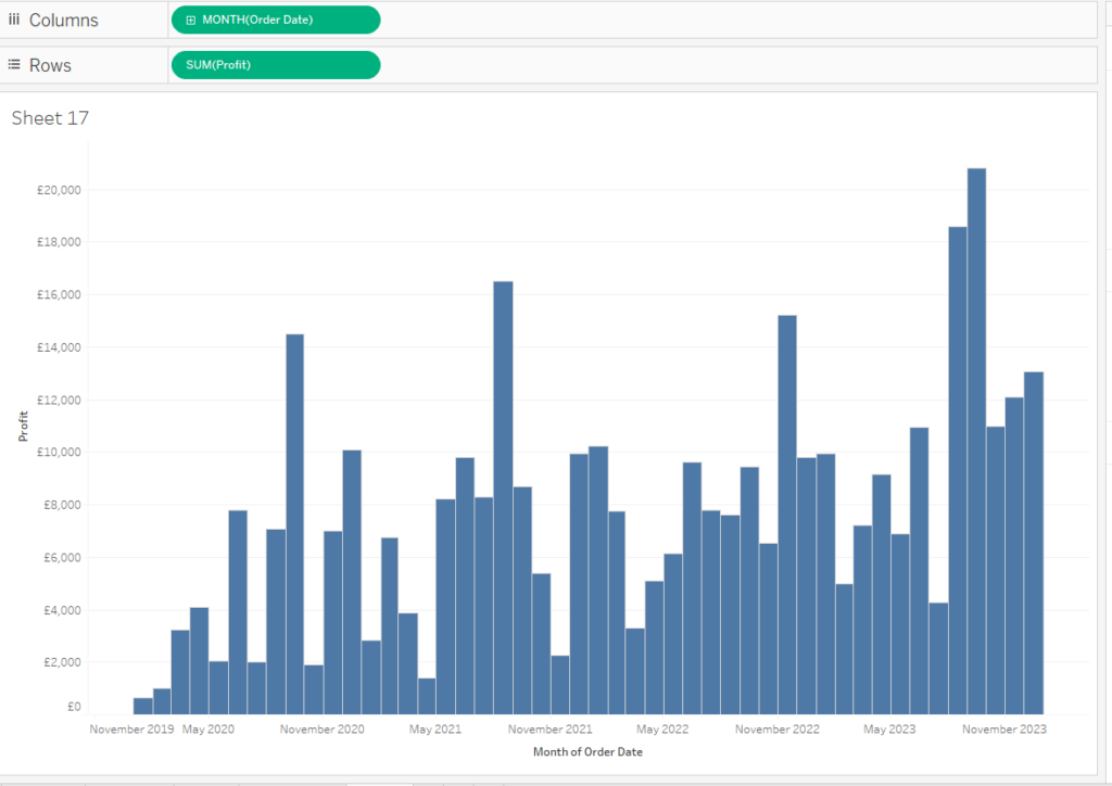
Step 3: Create Parameters🔄
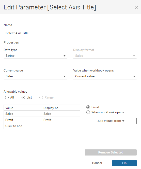
To make the axis title dynamic, you’ll need to create a parameter. Click on “Create Parameter” from the dropdown menu in the top menu bar. Name the parameter appropriately, such as “Select Axis Title” and choose the desired data type (usually string).
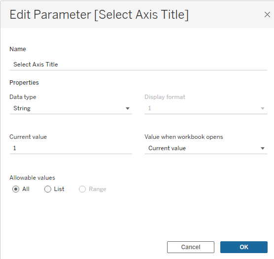
Step 4: Edit the Axis Title🏷️
Next, right-click on the axis title you want to make dynamic (e.g., the vertical axis representing Sales) and select “Edit Axis.” Within the “Edit Axis” dialog box, input the following formula in the Title field:
[Select Axis Title]
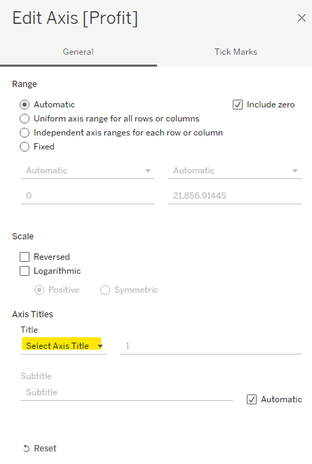
This formula refers to the parameter you created, allowing the axis title to dynamically change based on the parameter selection.
Step 5: Create Calculated Field📝
Now, create a calculated field that links the parameter to the axis title. Navigate to the “Analysis” menu and select “Create Calculated Field.” Name the field appropriately (e.g., “Dynamic Axis Title”) and input a formula similar to the following:
					IF [Select Axis Title] = "Sales" THEN "Sales"
ELSEIF [Select Axis Title] = "Profit" THEN "Profit"
ELSE "Other Title"
END
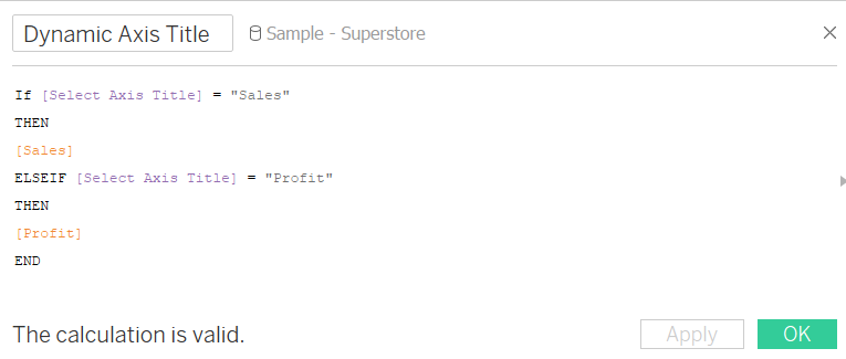
This formula checks the parameter selection and sets the axis title accordingly. Adjust the titles and conditions based on your specific data and requirements.
Step 6: Assign the Calculated Field to the Parameter📊
Go back to the “Select Axis Title” parameter and click on “Edit.” Choose “List” as the allowable values and add the relevant titles (e.g., Sales, Profit) that correspond to the conditions set in your calculated field.
Step 7: Test the Dynamic Axis Title⚙️
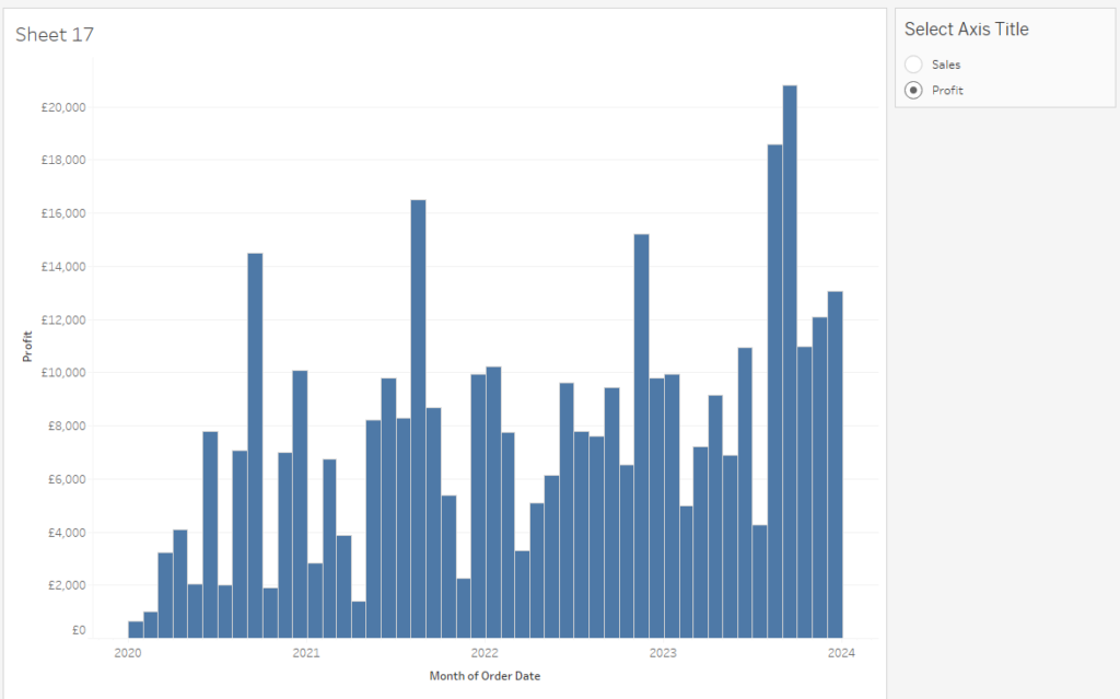
Now, by using the parameter control, you can dynamically change the axis title. Simply select different options from the parameter dropdown, and the axis title will adjust accordingly.

Conclusion
Creating dynamic axis titles in Tableau enhances the interactivity and flexibility of your visualizations. By following these steps and customizing the formulas according to your data, you can provide users with a more intuitive and informative data visualization experience.
Remember, the key lies in understanding your data and the purpose behind dynamic axis titles to effectively communicate insights to your audience.
Author
-

Tableau Certified Data Analytics professional with 7+ years of overall IT experience and 4 years of experience in analytics. Completed Post graduate program in Data science and Engineering from Great Lakes. Having good knowledge in Tableau, PowerBI, SQL and Python. Member of Data Visualization Society(DVS). Currently working as Data Analyst in Elsevier, a publishing and information analytics company.
View all posts

